There is an airport in Bend, Oregon where I live. We’ve got a proper one in Redmond, the next town over, but a little baby municipal one here in Bend. There is a cafe there that I’m only just hearing about: Bend Airport Cafe. Looks nice, I should go!
I’m mentioning it for another reason,though. As soon as I saw that website, I SAW CLAUDE CODE immediately.

Tell me I’m not crazy and you’ve seen it too.
This look is everywhere. To my eyes, it’s more prevalent than Bootstrap ever was, Tailwind UI, or even the purple-gradient-text era of crypto and early AI.
I feel like it happened as Anthropic started talking about skills and made their own design skill. The designs coming out of Claude Code are undeniably much nicer, but do look very same-y, like they have some pretty strict prompts baked in that choose between a very limited subset of design choices.
About this particular restaurant website, I feel like it’s quite decent looking and I don’t hate that maybe the design bar for low-end work gets pushed higher because of this, but also HEY EVERYBODY, let’s keep a close watch on all this. These AI slop websites are chockablock with really simple mistakes.
The navigation of the site is mostly jump links like #catering, which work fine when on the homepage. But the “Gallery” page links to /gallery, and when you’re on that page, the jump links don’t work anymore. Even the logo is just a link to #, so when you’re not on the homepage, it doesn’t get you back there.

I was reading Piccalilli’s in-depth guide to customising lists with CSS and thinking about what a nice touch customized lists are. Oh look, a nice customized list! Nah, just kidding, it’s a totally unsemantic div soup with a bunch of Tailwind classes.

::marker.This is what extra got me going the other day. Then I heard about another restaurant in Bend for the first time: Los Andes.
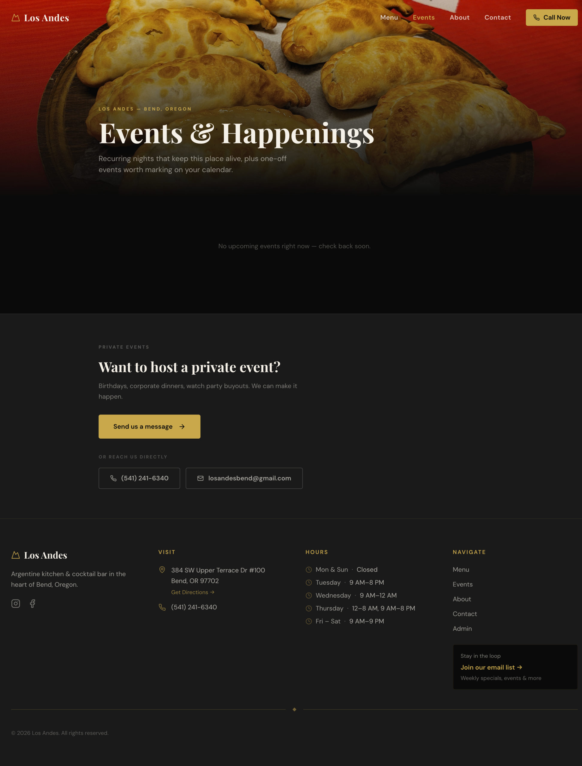
I know you can just smell the Claude design skill wafting off that sucker.
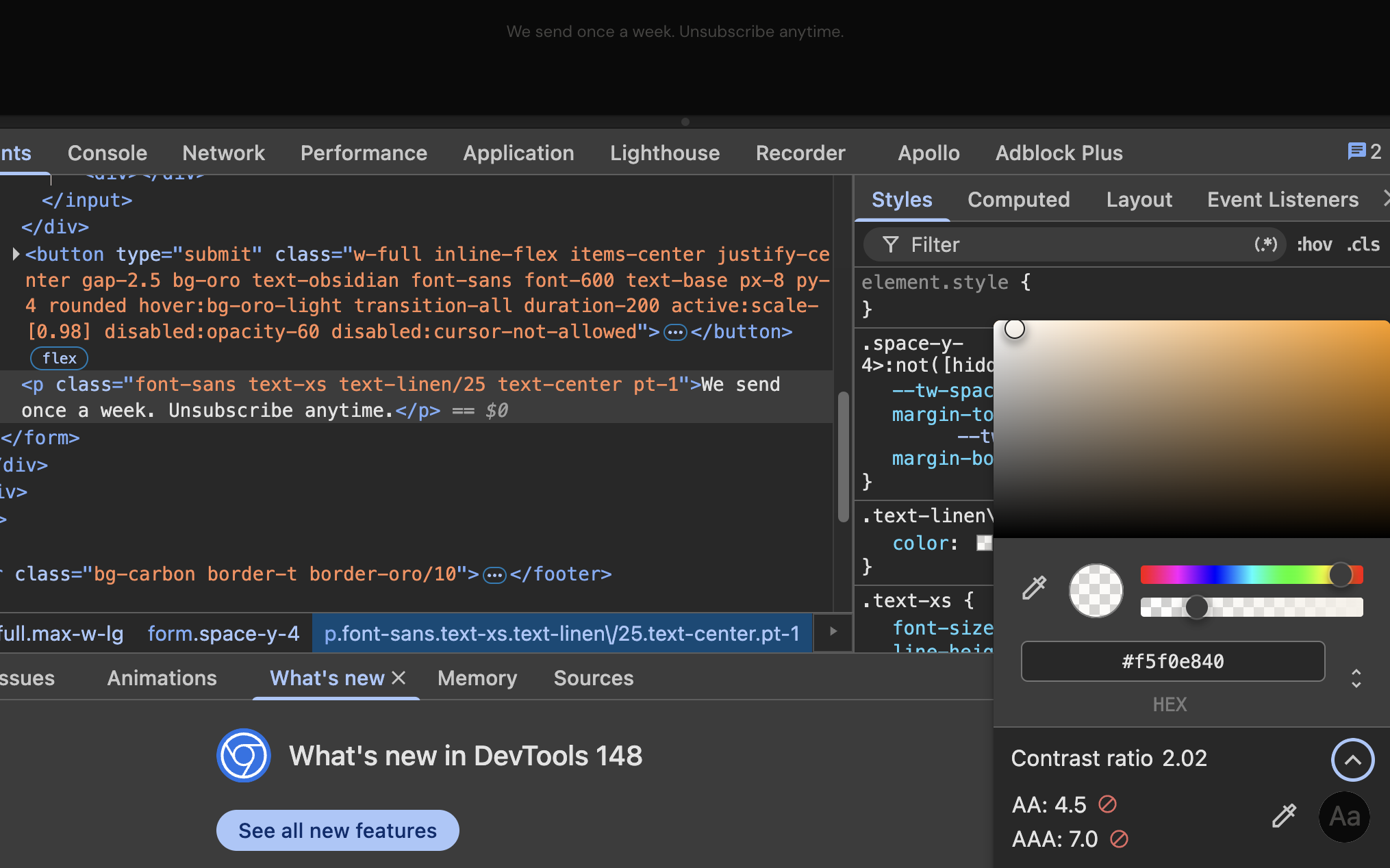
It doesn’t just look the same though, it’s full of dumbass simple mistakes. Like the one-field form doesn’t associate the label correctly.

The light gray text used isn’t even close to readable, even for someone with strong vision.
There is a little irony to me in that surely Clade Code could help anyone fix these problems so quickly and easily. But either people don’t know they are even problems or don’t care and both of those options are a bummer.
The same-y design choices are such a hilarious tell though. I had it help with a adding design to a Vue Template a while back, and honestly it looks pretty great I think! But it’s 100% that same exact design aesthetic happening here too.
The one-word-is-italic-in-the-header is hilariously common to me, along with the one-button-is-outline-one-is-solid, and the little-tiny all-caps header above headlines. BASK IN IT:
The one that gets me the most is how every “card” style element has a dang hover on it though. It’s just everywhere. And it can be a real problem. It means that sometimes it’s an <a> or <button> wrapping the entire contents of a card, meaning a title, copy, image, etc, which is just silly. Seriously, they need to read this.
Lemme leave you with some good articles.
- Dave writes about approaching light/dark styles at a component level, with optional inversion, made quite simple really.
- Eric writes about the
infinitykeyword in CSS. I love the use case where using it withword-spacingforces one-word-per-line. Clever. - Roma writes about Responsive Cyclic Margins with some absolutely wacky clamp/max functions in order to get truncation of text happening at the end of text and before an icon. Just try to get that right, Claude.