Gradients can look super different depending on what color space you have them interpolate in. It’s sRGB by default, and there is a decent chance you’ve never even thought about it. But it’s a small syntax change to change that, as Keith Grant documents.
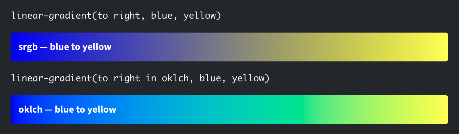
One of those is not better than the other. Maybe it’s a bummer that the color desaturates midway through the sRGB range, but maybe the trip to bright green town is a bummer in OKLCH. Or maybe they are perfect! The point of Keith’s article is that unexpected colors can appear between colors across various color spaces, and it can almost feel like a bug.
There are more color spaces to try: srgb, srgb-linear, display-p3, display-p3-linear, a98-rgb, prophoto-rgb, rec2020, xyz, xyz-d50, or xyz-d65. Here’s a good visual.
OKLCH certainly isn’t immune to weird colors in gradient interpolation, but I do generally think it does a good job and remains my favorite color space. You can also punch in color stops to prevent it, or just pick a different color space if you don’t like the results you’re getting.
Part of the magic of OKLCH is well explained here by Jakub Krehel:
oklchis a newer color model that is designed to be perceptually uniform. This means that colors are much more accurate in terms of how humans perceive them and it makes working with them much easier.
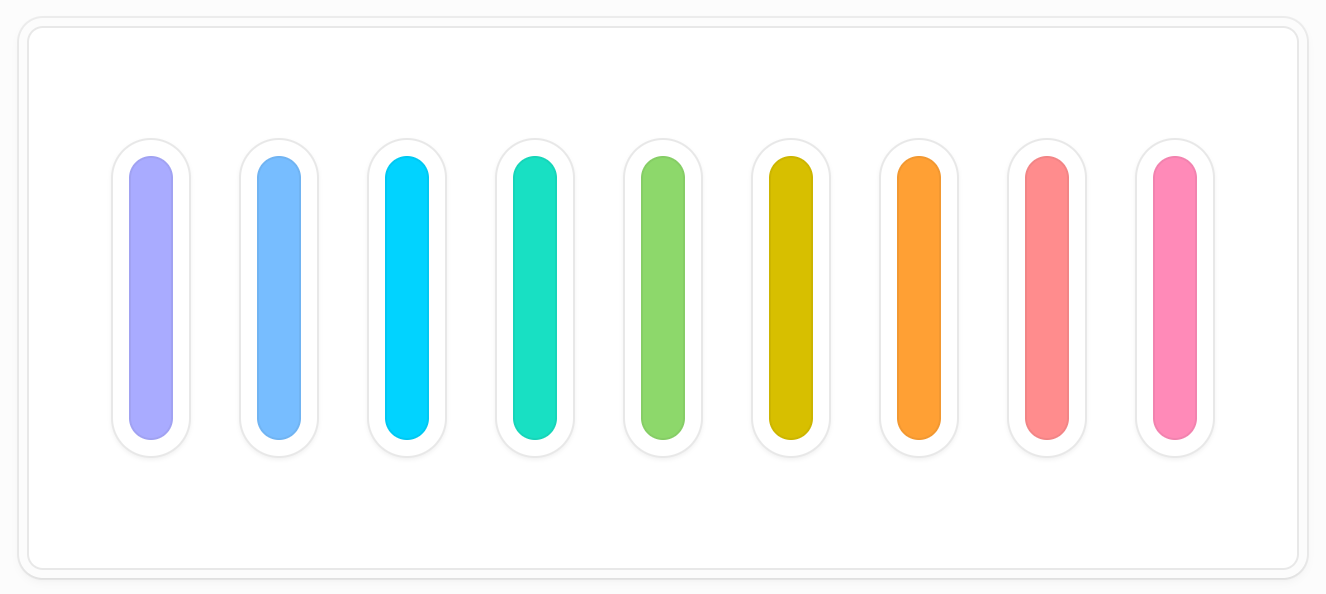
Same lightness but different hues, the all feel equal. I love that.
Note that there is a difference between a color space and the color functions we have in CSS. I bet you’ve heard of or used hsl() before, which was kind of the “intuitive” color format of the past (hue, saturation, lightness). It made working with color programmatically a lot easier, too, with individual variables to adjust the color. But hsl() is in sRGB and there’s no changing that. Yet another reason oklch() is nice, as it retains that intuitiveness (mostly) with a nicer (and bigger!) color space.
Ol’ hsl() had a buddy, hwb(), which apparently nobody used. It stood for hue, whiteness, and blackness, which is conspicuously missing a saturation value, which is just weird and definitely not intuitive.
Oh hey, while we looked at the fun little syntax change to adjust a color space in a gradient, it’s worth knowing there are a few more keywords you can add to affect the gradient. Usually, a gradient will take the shortest path between color stops in a gradient, but you can tell it to take the longest path as well.
html {
  background: conic-gradient(in oklch longer hue, red, red);
}Code language: CSS (css)
That goes from red to red which ain’t much of a gradient. Unless you tell it to go the long way, and then:
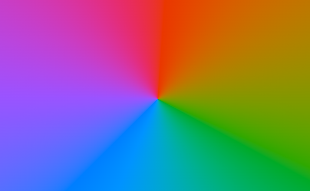
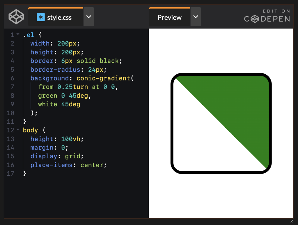
I made that when I was playing with conic gradients and triangles the other day. The ability to move the center point of a conic gradient (say, to the top left) and then use hard-stop color gradients means nice angular control over “drawing” triangles.
OK lemme leave you with a few more cool color links burning a hole in my pocket.
ColorFlow has a really cool mesh gradient generator.
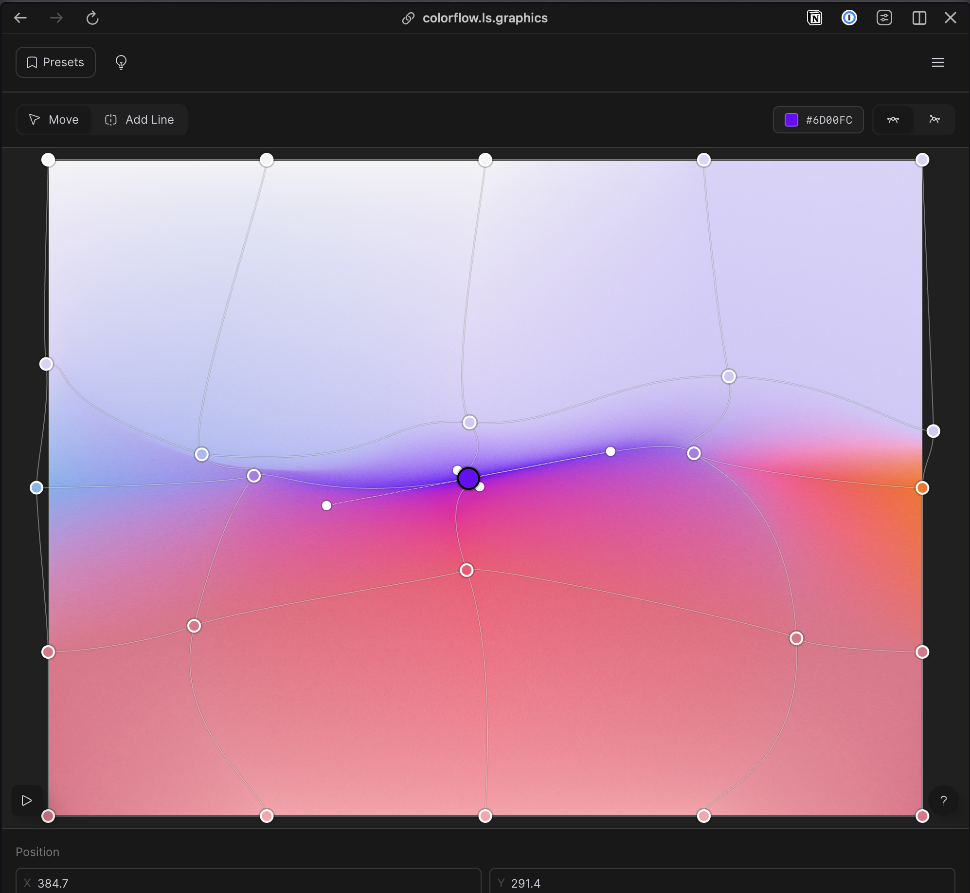
I’m tempted to say something quippy like hell is other people’s color palette generators. But I know people like using them. I just feel like every color palette I’ve made is so personal, and I like spending the time hand-fiddling with things until I get it right; then it’s kinda just done forever. I generally don’t need a “quick generator” kind of thing, and as such, I tend to not connect with palette generators with lots of fancy knobs and whistles.
That said, the visual design of ColorPalette Pro from Ryan Feigenbaum is super cool, who fully admits:
Nothing beats the practice of a good eye and keen sensibility.