Finding the typeface you need is a whole thing. You’ll know it when you see it is one approach. Look at a lot of choices. Make sure to save ones that you think are really nice, even if they aren’t the winner this time. On my local machine, I use an app called Typeface. I try to tag stuff in categories that make sense to me. I have a good amount of nice stuff in there, but still, when looking for a web project, it’s limiting, because I don’t have local versions of all the typefaces that would be good candidates for a web project. All of Google Fonts, for instance, I have no interest in keeping local copies of. And it’s extremely cost-prohibitive to buy every great font I see available for purchase.
I find it interesting to look at ways to explore typefaces in novel ways. For instance, font.fish has a way to explore them in a big scrollable grid.

As you explore clusters and axises, you can see how the groupings work and perhaps find what you need by virtue of similarity and variation in what you need.

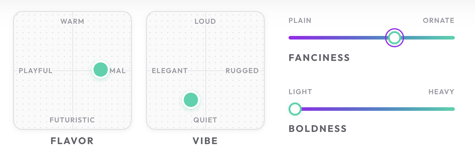
Sweetfont has a different approach where you move around on different axises like from Loud to Quiet or from Playful to Formal. Then ultimately just see one particular font that fits the bill.
A more traditional way to organize fonts is to just make broad relatable categories, like Typographer does.

And to be fair, Google Fonts does have that, too. They’ve come a long way.

But nothing sells a font like a good ol fashioned specimen page. It’s hard for me to look at practical any specimen page and not be sold on it. For instance, I’d love to work on a product that got to use MD UI.

Maybe typeface specimen pages could be like a whole coffee table book? That would be sweet. Oh, wait, Elliot Jay Stocks is already all over it.
