New feature for all!
When we first set out designing the CodePen editor, we went with the three editors across the top and the preview along the bottom because, well, we just liked it. The “landscape” proportion of the preview on the bottom matched the shape of the thumbnail previews elsewhere on the site and that was pretty cool. We also liked being able to expand the editors to full width as needed.
But as time went on, enough users made it clear they preferred other layouts for the editor or at least wanted some choice. Having more vertical space to write code can be just as important as horizontal space. And if you need both, sometimes it makes more sense to “squish” live preview horizontally instead of vertically. Especially in the days of narrow screen mobile design.
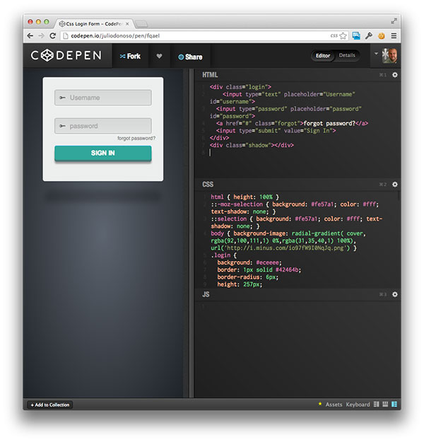
We heard you, and it’s here! Now you can change between the “Left”, “Top”, and “Right” editor styles with new switcher buttons on the bottom left of the editor screen:

Here’s the left view:

Right view:

And the classic top view:

Just as you could in the classic top view, you can expand each editor to “full” size in either right or left view. This gives you more vertical space to write in. You can also still use the resizer bar to give you more or less horizontal space.

Big high fives to Matthew Wagerfield who did a lovely mockup of how this might work that was a close match to our own vision. This was the spark we needed to get going on the task.
@codepen it would be awesome if you could create an optional horizontal layout similar to @googlechromedev tools » cl.ly/image/3v310x3s…
— Matthew Wagerfield (@mwagerfield) March 5, 2013
And to Tim Holman who went the extra mile to write some custom CSS to get the ball rolling:
@soulwire @chriscoyier @mwagerfield @codepen – Here’s a useable version, I like it! – gist.github.com/tholman/5100274 (i.imgur.com/NWaoRqi.png)
— Tim Holman (@twholman) March 6, 2013
Enjoy!