Jake Archibald writes that we should just not use footnotes on the web. Not use footnotes?! I love a good footnote. Or at least, I thought I did. It’s where you can stick some information that provides a bit of extra context, but would be distracting if smashed into the main text. They can even change the tone, like how you can insert a joke where it might not work otherwise.
But it would be hard to read Jake’s full-throated argument against them on the web. They really do jostle you around the page awkwardly, simply because of the nature of the web and typical designs. Jake’s “just use some damn parentheses” is slightly tongue-in-cheek but not without merit.
Personally, I like the ideas that take more advantage of the unique powers of the web. Specifically the alternative that is:
- An
<aside popover>opened/closed entirely with HTML attributes. - Positioned with anchor positioning
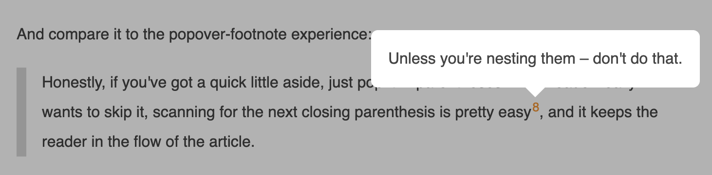
Color me a fan. Tooltips are the perfect use case for this technology combo. And a footnote can totally be a tooltip, as can a menu. Sidenotes are nice too, if a design can pull it off.
While we’re doing type stuff, Kelly Choyce-Dwan’s deep dive into balancing type across languages is excellent: Typography troubles: Balancing lines in Japanese & Korean. I’m perfectly guilty of looking at new CSS tech through the lens of setting type in English and getting excited before understanding the non-English ramifications.
In this case, as nice as text-wrap: balance can be sometimes…
When working with multilingual text, line breaks don’t always behave as expected. For example, we added
text-wrap: balanceon WordPress.org, and quickly got community feedback that it led to awkward, unexpected breaks in Japanese and Korean.
Which, yay, has a fancy solution using an auto-phrase value I’ve literally never heard of:
h1, h2, h3, h4, h5, h6 {
  text-wrap: balance;

  &:lang(ja) {
    text-wrap: initial;

    @supports (word-break: auto-phrase) {
      word-break: auto-phrase;
      text-wrap: balance;
    }
  }
}Code language: CSS (css)
Make sure to click over to the article for the Korean fix.
Have you heard of “faux bold”? Or “faux italic”? It’s this (kinda nasty) thing a browser will do to characters in type when you’ve asked for the bold or italic version of a font, but you haven’t actually loaded that font. So the browser is like fine I’ll just do it for you then and it, without exception, looks like 💩.
The solution, if you’re loading up custom fonts, is to ensure you’ve got an @font-face rule that covers those font-weight and font-styles before using them. Richard Rutter has a good blog post on this, which includes a nifty trick for detecting if you’re accidentally doing it wrong.
@keyframes flip-synthesis {
  0% { font-synthesis: none; }
  100% { font-synthesis: initial; }
}

body {
  animation: 3s infinite flip-synthesis;
}Code language: CSS (css)