The real reason that fancy modern CSS is exciting is because of what we can now actually do in CSS.
I remember one of my favorite dudes Hakim El Hattab made a thing called “Progress Nav” ten years ago. The idea is a Table of Contents component that could tell where you are scrolled in the page and reflects that in the design of the ToC.
Perhaps you won’t be surprised that functionality works via JavaScript. It’s not horridly huge or complex, but, it does rely on totally-not-even-debounced window.addEventListener( 'scroll', ... which is known to be a cause of janky performance.
But it’s cool, right?!
This kind of thing has been come to be known as a “scroll spy” effect. I’m sure you can see where I’m going with this: CSS can do scroll spy now. In Chrome anyway. Remember when all that CSS carousel stuff was happening? This is highly related. I remember people gently trying to say this isn’t just CSS carousels, it’s interesting CSS primitives that combined can make a carousel, but totally have other users too. Well, here’s something.
Una’s blog post is a live demo of it working.
Here’s the main CSS that does it:
.parent { scroll-target-group: auto; }

:target-current { /* styles for active anchor */ }Code language: CSS (css)
Wow.
It’s also obviously ultra important that we can do Battlestar Galactica corners, as Dave explains:
… the sci-fi film and television trope where all rectangles (doors, windows, furniture, user-interfaces) have one to three angular corners instead of all corners being the old, boring, un-futuristic 90º rectangle corners. They are the cooler version of rectangles by all accounts.
Another two-liner 😍:
.sci-fi {
  border-start-end-radius: 50px;
  corner-shape: bevel;
}Code language: CSS (css)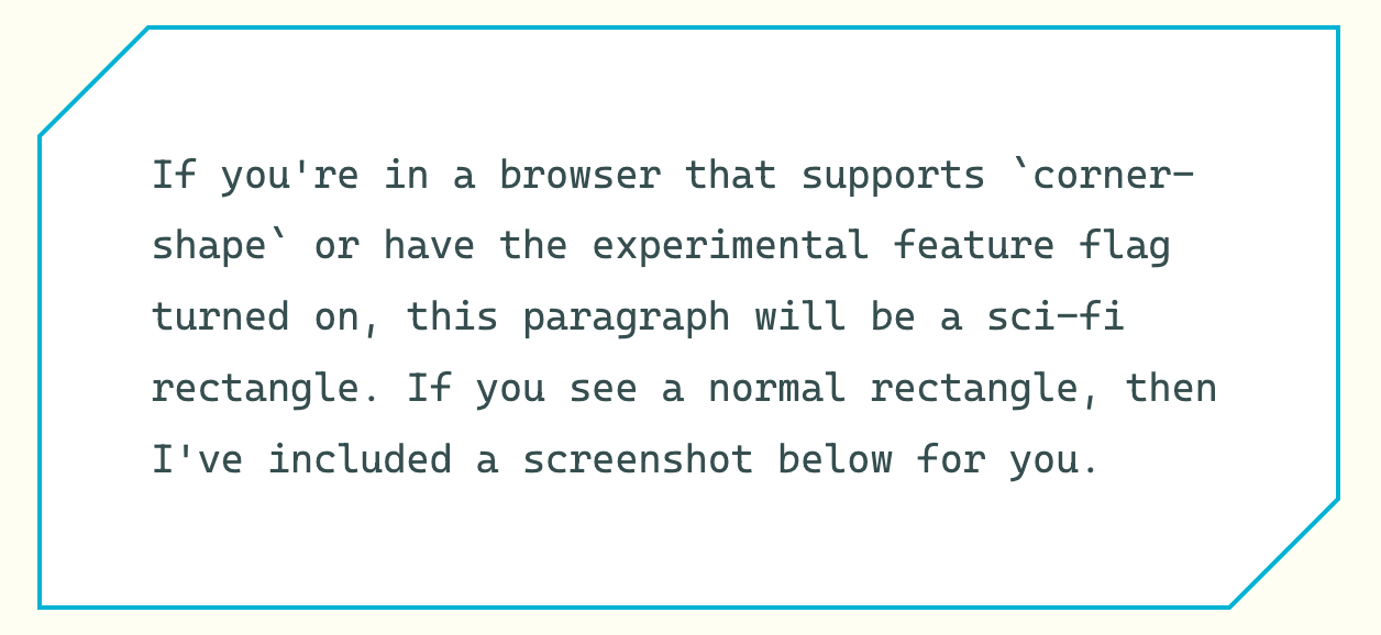
You know when an element moves when View Transitions are used? They say “they aren’t screenshots” used during the moving/morphing… but… they kinda feel like they are screenshots. And so, sometimes it looks awkward. Bramus notes that an example of this is when an element has a different border-radius. Fixing this is more complicated than I’d like it to be and showcases how sometimes these fancy features require a pretty deep dive once you get into the details. The good news is there is a (slightly) simpler approach, which requires thinking about the individual parts you are actually animating. That part, thankfully, makes sense to me. Like giving the element itself and the guts of it different names:
.card {
  view-transition-name: card;
}

.card > .card-content {
  view-transition-name: card-content;
}Code language: CSS (css)
I’ll leave you with a beast of a Julia Micocene blog post about lighting in 3D CSS.