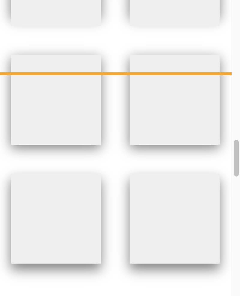
Andy Bell with pitch perfect bait for me: Fun shadow coding challenge. Just a simple line across a page, but imagine that line is a light source. Squares below the light source have a box-shadow. How can we make it so as the squares scroll by, that box-shadow adjusts itself to honor that “light source”?
JavaScript? Of course, the all-powerful JavaScript can do this. That’s what Andy himself did eight years ago with the inception of this idea.
Kitty Giraudel blogged in with a solution involving animation-timeline: scroll(); which I’m quite sure is just the kind of thing Andy was fishing for. But Kitty relied on some information from JavaScript:
In CSS we can’t read
offsetToporoffsetHeight, so we pass them from JavaScript as custom properties:
This isn’t illegal, of course.
I think this is one of these things where some JavaScript is not only needed, but also probably quite important to craft a solution that makes fewer assumptions and work nicely in more flexible circumstances — even if still relying on scroll-driven animations.
But certainly it’s fun to flex those muscles a little harder and see if there is a way. Roman Komarov jumped in and used scroll-driven animations as well, but of the animation-timeline: view(); type rather than scroll(). I think this is key as then we’ve unlocked information about the boxes position within the viewport that we wouldn’t have otherwise. I kinda love Roman’s solution as it doesn’t adjust individual box-shadow values at all, those just adjust from a shadow generally “pointed down” to “pointed up” and it interpolates between them. All the logic is tucked into the animation-range declaration.
There is a take where the box-shadow values are manipulated directly with a view() scroll timeline though, from Chris Bolson. Each of the shadows properties are directly manipulated in the keyframe. Like others, this requires the custom properties to be @property delcared with a type so that the animation knows how to animate them. Chris’ approach is extra classy as it has this touch where the further away from the light source, the lighter the shadow, which feels great.
Chris Wachtman jumped in with some alternate takes based on the light source idea. Like what if the light source wasn’t a line, but instead your cursor turned into a little sun!
CSS is so cool. Kitty, Chris(es), Roman, you’re pretty cool too.