It’s always interesting observing multiple people attack the same problem. Sometimes they aren’t even aware of each other. Like how Isaac Newton invented calculus in the mid 1660’s in England, then Gottfried Leibniz did the same a decade or so later, independently (or so it is said).
I just read Ibrahim Bendebka’s recent take on Flexbox Masonry Layout. This approach is thick with mathematics, which I cannot pretend to fully understand. I understand the requirements, though, as it’s having a bunch of elements with known aspect ratios laid out into rows that cleanly fill the horizontal space. You don’t get that behavior by default, so it requires using aspect-ratio that you calculate and then also apply to flex-grow, so it requires understanding the flexbox model pretty deeply.
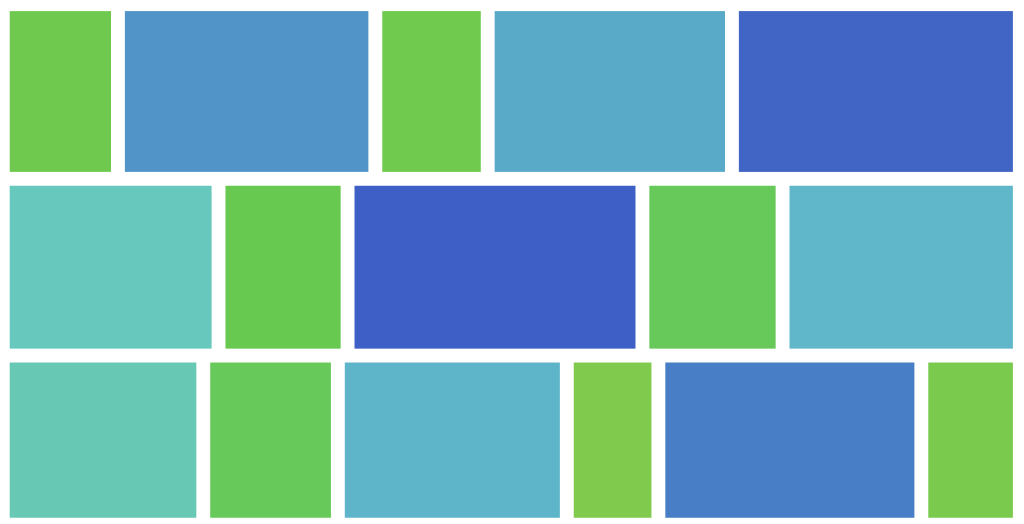
Late last year, Ian Kilpatrick came across the same exact idea in Exploiting flex-grow for an Image Gallery, and I really have no idea whether Ibrahim and Ian know of each other. But in both cases, the aspect ratio is calculated and used. This is necessary to keep the elements of equal height and exploit how flex-grow works to get even edges.

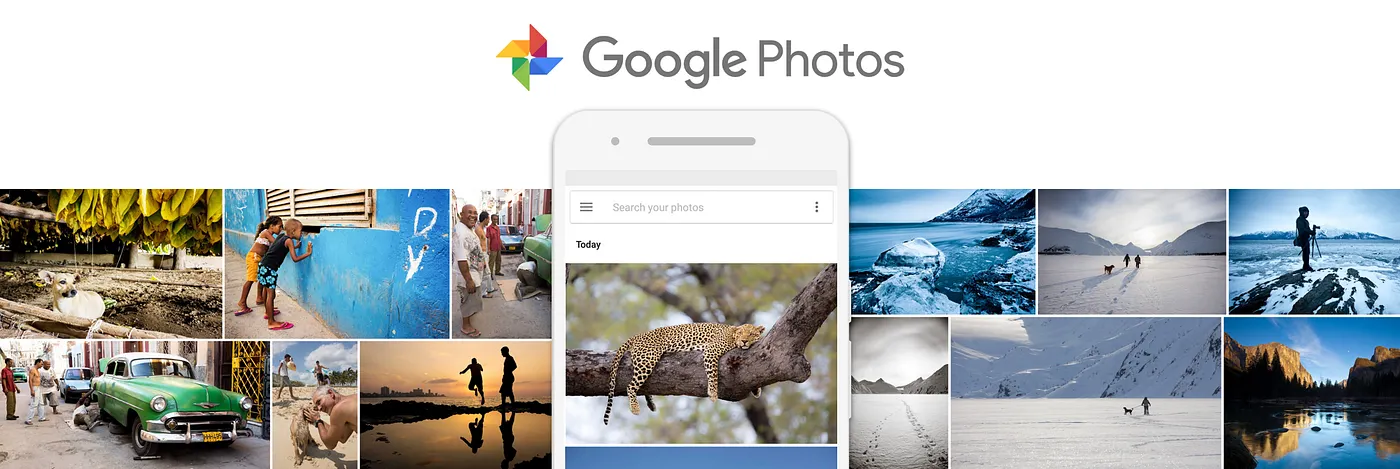
Ian was aware of Antin Harasymiv’s take in Building the Google Photos Web UI from 2018, but it didn’t detail the specific web-based layout solution to get there.
I’d stop there, because that’s already pretty interesting seeing three people very mentally invested in this exact same problem. But of course there are more.
- (2019) Tim Van Damme worked out an Adaptive Photo Layout with Flexbox which is much simpler and very close to the same, just doesn’t match aspect ratios perfectly.
- (2022) Nils Binder wrote Building a combined CSS-aspect-ratio-grid which lands in exactly the same place, starting with pre-calculated aspect ratios.
- (2015!) Kartik Prabhu has probably the earliest take with Equal Height Images with Flexbox, literally latching onto
flex-growand its “weird” behavior.
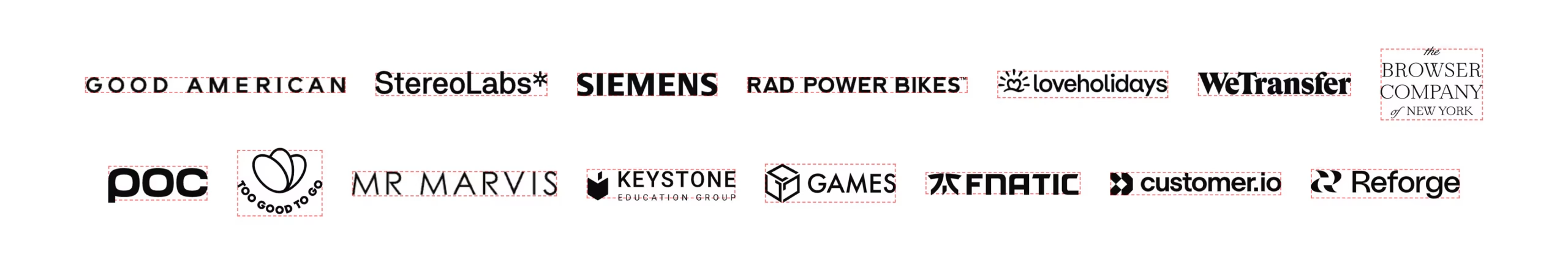
In a related vein, I enjoyed Rostislav Melkumyan’s take on “The logo soup problem”. This problem also has many solutions over many years. The idea is similar in that logos can have extremely different aspect ratios. And just plopping them into a grid without much thought it almost sure to make them look awkward.
The solution presented here requires more work that just aspect ratio alone. There is also a scaling factor that needs to be tweaked to balance the logos, as a start. But each logo can have a different “visual weight” which is really the thing that can throw a grid of logos off, visually. Fortunately even that can be calculated with “pixel density” and used as additional scaling information.
These grids typically have something of a “masonry” feel to them in that the grid lines aren’t straight both vertically and horizontally. Although, as weird as it is, “masonry” usually refers to straight vertical lines and staggered horizontal ones (like a brick wall turned sideways). This has been the subject of much standards work over many years, but the answer to this style of layout is called “grid lanes“. Me, I’m using BaseWatch to get notified when it’s more ready to use.
Lemme leave you with three more layout related links to close out:
- CSS Grid: A helpful mental model and the power of grid lines by Saron Yitbarek
- Understanding the fundamentals of CSS Layout by Kilian Valkhof
- (Course) The Layout Maestro by Ahmad Shadeed