I love ideas that feel clearly better than what was before. I used to feel that way about curved shower curtain bars. Like, instead of the shower curtain being perfectly straight against the edge of the shower, it curves outward. No harm in functionality, but it gives more space inside the shower. It’s just better. There are more factors, though, sadly. Surely they are harder to manufacture, package, and ship, and thus more expensive. Maybe you need longer shower curtains, too? Maybe there isn’t always space for it in smaller bathrooms? I still generally prefer it when possible. It’s an optional improvement.
Here’s another thing like that: Put the ZIP code first.
The big idea is that we should ask for the ZIP code in an address first, not last. Here’s what address forms often look like:
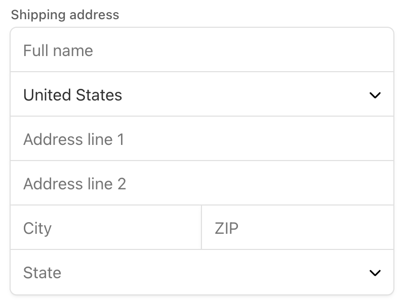
ZIP code is 2nd to last there. Notably, before the City. But if we asked for the ZIP code first, the city would just be implied, saving time filling out the form. Time saved during e-commerce checkouts is a proven way to improve conversion rates.
As that microsite says:
From those 5 characters you can determine the city, the state, and the country. That’s 3 fields. Autofilled. From one input.
That’s just better, right?
Seems better to me, but I bet there are more factors. For one, it’s different, and different might feel weird to users and throw them off, maybe not saving time at all. People have addresses in their head in a certain way/order, and matching that might have its own benefit.
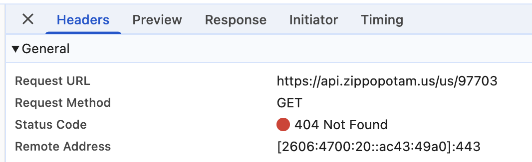
For another, this requires extra code to work. You need some kind of reliable and updated ZIP code matching software. Extra notably, the demo on that page doesn’t even work. I get a 404 for the API they are using:
Also, and this I know is true, but I am ignorant about the details: ZIP codes are weird. They have different formats and aren’t necessarily globally unique. So asking for the country first is actually probably best, even if that’s one of the most painful parts of address forms.
Still, maybe it’s an improvement! Maybe try it!
Ya know that screenshot from above? That’s actually from Stripe Elements, which is super incentivized to make payment forms that convert well. This is what they actually do by default (in their own demo):
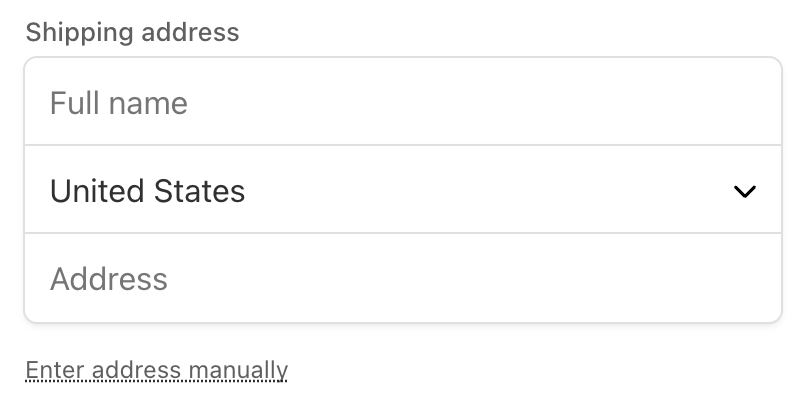
Me, I’d think that Address field would be full of magic. You could drop in the ZIP code and it would prefill stuff. Or you could single-line type your entire address and it would just know what you mean and deal with it. But no, actually, that’s just what it wants for your street address line, and if you fill it out and press Enter or Tab, it expands to show you all the fields it actually needs. Weird.
The more magic at helping me fill out forms, the better really. Make them accessible. Use all the fancy attributes to make them more understandable for tools and improve UX. Do fancy backend processing. Use the geolocation API. Whatever. Nobody loves filling out forms, they love what the form helps them do.